

Why Salesforce Marketing Cloud Click Reports Do Not Tell the Full Story
Salesforce Marketing Cloud click reports are essential for measuring email engagement. They help campaign teams understand how many clicks an email generated, which links subscribers selected and which campaigns achieved the strongest click-through rates.
However, click reports do not always explain the complete story behind subscriber behaviour.
A report may show that one email generated 1,500 clicks. But it may not immediately reveal whether those clicks came from the primary call to action, the hero image, a product card, the navigation menu, a social icon or the View in Browser link.
Salesforce Marketing Cloud tracks email engagement events such as opens and clicks, and its reporting tools can provide campaign-, send- and subscriber-level information. Salesforce also provides aggregate and individual link-level report types. However, campaign teams still need to interpret those numbers in the context of the email creative.
That missing visual context can prevent marketers from understanding why an email performed well—or why it failed to convert.
Click Reports Tell You What Happened
Standard Salesforce Marketing Cloud reporting can help teams answer questions such as:
How many subscribers clicked?
How many total clicks were recorded?
Which destination URLs received engagement?
What was the campaign click-through rate?
Which subscribers interacted with the message?
Which sends produced the highest engagement?
This information is valuable for measuring campaign performance.
But it primarily explains what happened after the email was delivered. It does not automatically explain how the email’s design, content hierarchy and CTA placement influenced those clicks.
For example, two emails may achieve the same click-through rate while producing completely different behaviour.
In the first email, most subscribers may select the primary “Request a Demo” button. In the second, subscribers may click several navigation and footer links while ignoring the main conversion CTA.
The headline metric may look similar, but the business outcome could be very different.
The Report Is Separated From the Creative
One of the biggest limitations of conventional click reporting is that the numbers are often reviewed separately from the email design.
A URL table may show:
Link A: 700 clicks
Link B: 340 clicks
Link C: 125 clicks
Link D: 48 clicks
The marketer must then open the email, identify each link and determine where it appeared.
Was Link A the hero image or the primary button? Did Link B appear near the top or bottom? Did several creative elements use the same destination URL?
This manual comparison takes time and makes reporting more difficult for stakeholders who did not build the campaign.
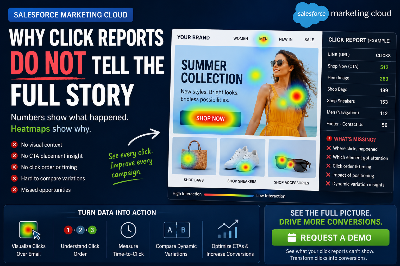
An email heatmap solves this problem by displaying click engagement directly over the rendered email.
Total Clicks Do Not Equal Conversion-Focused Clicks
Not every click has the same business value.
A subscriber clicking a logo is not necessarily showing the same level of intent as someone clicking “Buy Now”, “Register Today” or “Request a Demo”.
Campaigns can generate clicks from:
Logos
Navigation menus
Hero images
Product cards
Text links
Social media icons
Legal links
Preference centres
View in Browser links
Primary and secondary CTAs
When all clicks contribute to the overall campaign total, marketers may overestimate the effectiveness of the main conversion journey.
A visual heatmap helps teams separate general interaction from conversion-focused engagement.
It can show whether the primary CTA controlled subscriber attention or whether competing links distracted users from the intended action.
Repeated Destinations Can Hide CTA Performance
An email may contain several elements that point to the same landing page.
For example, the hero image, headline, supporting text and CTA button may all link to one product page.
When reporting is focused mainly on the destination URL, it can be difficult to understand which creative element generated the click.
This is why meaningful link names, aliases and titles are important.
Each linked element should be identified separately, using names such as:
Hero_Image_SummerSale
Hero_CTA_ShopNow
Product01_Image
Product01_ViewProduct
Footer_RequestDemo
This structure makes link-level reporting clearer and helps connect each tracked interaction with its exact position inside an email heatmap.
Click Reports Do Not Automatically Explain Click Order
The sequence in which subscribers interact with an email can provide valuable behavioural insight.
A standard total-click report may show that three links were selected. It may not clearly communicate which link received the first interaction and which links were selected later.
Click-order intelligence can help teams understand:
Which element initially attracted attention
Whether subscribers followed the intended content journey
Whether they skipped the main hero section
Whether a secondary CTA distracted from the primary CTA
Which products generated immediate interest
If subscribers repeatedly click a navigation link before the main CTA, the email hierarchy may not be supporting the campaign goal.
CRMx Email Heatmaps can connect click-order data with the email creative, making the interaction sequence easier to interpret.
Click Reports Need Time-to-Click Context
The timing of an interaction can be as important as the click itself.
A subscriber who clicks within two minutes of receiving an email may have stronger or more immediate intent than someone who returns several days later.
Time-to-click analysis can help marketers evaluate:
Urgency-based promotions
Product launches
Event registration emails
Abandoned basket journeys
Appointment campaigns
Limited-time offers
B2B lead-generation campaigns
This information can also support follow-up decisions.
For example, subscribers who click quickly but do not convert may be suitable for a timely reminder, sales follow-up or retargeting journey.
Aggregated Reports Can Hide Dynamic Content Performance
Salesforce Marketing Cloud is frequently used to personalise emails by country, language, location, product affinity, lifecycle stage and customer segment.
Different recipients may receive different:
Hero images
Headlines
Product recommendations
Offers
CTA text
CTA destinations
Content blocks
When every variation is combined into one aggregated campaign report, marketers may not see which personalised version produced the strongest engagement.
A campaign might appear successful overall while one country or content variation performs poorly.
CRMx can help teams compare separate dynamic email variations, allowing marketers to understand which images, messages and CTAs work best for each audience.
Some Recorded Clicks May Not Be Human
Click data can also include automated interactions.
Salesforce explains that anti-spam, antivirus and email security systems may scan email links before delivery. These systems can create recorded clicks and inflate tracking metrics. Salesforce also states that its tracking systems cannot always determine whether an open or click was generated by a person or a system.
Warning signs may include:
Clicks occurring immediately after delivery
Every link being clicked within seconds
Footer and legal links receiving unusual engagement
High click rates without corresponding conversions
Large click volumes concentrated within one corporate domain
Click timing, click order and visual engagement patterns can help teams identify behaviour that may require further investigation.
Click Reports Do Not Show the Entire Browser Journey
Some subscribers leave the inbox by selecting the View in Browser link.
After the browser-rendered email opens, the subscriber may continue clicking, scrolling and interacting with the content.
The original email report may record the View in Browser click, but marketers may still need separate behavioural visibility into what happens on the browser page.
CRMx View in Browser analytics can extend reporting beyond the inbox by analysing supported interactions such as:
Browser-page clicks
Scroll behaviour
Mouse movement
Device and platform information
Session activity
Movement from the browser version to the website
This creates a more connected view of the customer journey from the inbox to the browser and then to the final destination.
Email Heatmaps Add the Missing Visual Layer
Salesforce Marketing Cloud click reports remain an important source of campaign data.
Email heatmaps do not replace that reporting. They make it easier to understand.
CRMx Email Heatmaps can help teams:
Display clicks over the original email creative
Identify high-, medium- and low-engagement areas
Compare buttons, images and text links
Measure total and unique clicks
Analyse click order
Review time-to-click behaviour
Compare dynamic email variations
Investigate possible automated activity
Analyse supported View in Browser interactions
Share clear visual reports with stakeholders
Standard click reports tell you that an interaction occurred.
CRMx helps show where it happened, which creative element generated it and what your team should improve next.
See the Story Behind Every Click
Campaign optimisation requires more than knowing the total number of clicks.
Marketing teams need to understand which CTA captured attention, which content created interest, which links caused distraction and which personalised variations influenced behaviour.
Salesforce Marketing Cloud provides the engagement data. CRMx turns that data into visual, actionable campaign intelligence.
Request a personalised CRMx Email Heatmap demonstration and discover what your Salesforce Marketing Cloud click reports are not showing.