

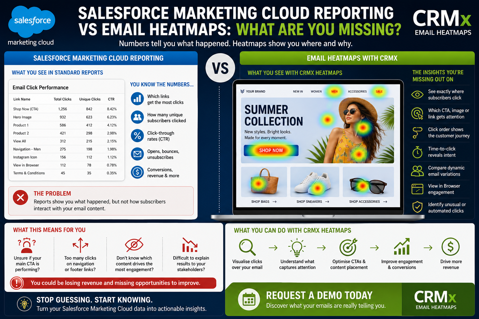

Salesforce Marketing Cloud Reporting vs Email Heatmaps: What Are You Missing?
Salesforce Marketing Cloud reporting gives email teams valuable campaign data.
Marketers can review sends, deliveries, bounces, opens, unique clicks, click-through rates and unsubscribes. Marketing Cloud Engagement also provides standard reports across Email Studio, Journey Builder, CloudPages, MobileConnect and other areas of the platform.
But knowing that a subscriber clicked does not always explain how they interacted with the email.
Which CTA attracted their attention?
Did they click the main button or the hero image?
Did a navigation link distract them from the campaign objective?
Which personalised email variation performed best?
Salesforce Marketing Cloud reporting provides the underlying engagement numbers. Email heatmaps add the visual context needed to understand what those numbers mean inside the email creative.
So, what could your existing reports be missing?
What Salesforce Marketing Cloud Reporting Shows
Salesforce Marketing Cloud Engagement tracks email activity through link redirection. When a recipient selects a tracked link, the interaction is recorded before the recipient reaches the destination.
Depending on your reporting setup, teams can analyse:
Emails sent and delivered
Total and unique clicks
Open and click-through rates
Bounces and unsubscribes
Individual subscriber engagement
Link-level performance
Journey and campaign activity
Conversion-related traffic and revenue
Email Studio reports can also show performance by list, including response, bounce and click-through rates.
These metrics are essential for measuring campaign performance.
However, they are generally viewed as numbers, tables, links or exported reports. The marketer must still connect those results to the design of the email.
The Missing Connection Between Data and Design
Imagine that a click report shows the following results:
Link A: 840 clicks
Link B: 460 clicks
Link C: 215 clicks
Link D: 90 clicks
The report tells you which tracked links generated activity.
But the marketing team may still need to open the email and determine:
Where each link appeared
Whether it was a button, image or text link
Whether multiple elements used the same destination
How prominent the element was
What content surrounded it
Whether it supported the main conversion goal
This manual process takes time and makes campaign performance harder to explain to designers, stakeholders and senior leaders.
An email heatmap places click activity directly over the rendered email, connecting engagement data with the creative element that generated it.
Standard Reporting Shows What Happened
Salesforce Marketing Cloud reporting is excellent at answering questions such as:
How many emails were delivered?
How many subscribers clicked?
What was the unique click-through rate?
Which URL received the most activity?
Which campaign achieved the best overall result?
Email heatmaps help answer a different group of questions:
Where did subscribers click inside the email?
Which creative element attracted the most attention?
Did the primary CTA control the interaction?
Which content was ignored?
How did engagement move through the email?
What should be changed in the next campaign?
The difference is not reporting versus no reporting.
It is numerical reporting versus visual behavioural interpretation.
Are Your Most Valuable CTAs Actually Performing?
A campaign can generate a strong overall click-through rate while the primary conversion CTA performs poorly.
Subscribers may click:
The company logo
Top navigation links
Hero images
Product images
Secondary content
Social media icons
Footer links
View in Browser links
All these interactions contribute to campaign engagement, but they do not necessarily have the same business value.
A click on “Request a Demo” may be more commercially valuable than a click on the company logo.
A click on “Complete Purchase” may show stronger intent than a click on an Instagram icon.
A visual email heatmap helps teams see whether the primary CTA attracted a meaningful share of engagement or whether secondary elements distracted subscribers.
Can You See Which Element Generated the Click?
Several email elements can link to the same destination.
For example, the following may all point to one landing page:
Hero image
Campaign headline
Primary CTA button
Supporting text link
Product image
When reporting is organised mainly around URLs, teams may find it difficult to identify which placement produced the interaction.
Meaningful link aliases and title attributes can distinguish individual elements, such as:
Hero_Image_SummerOffer
Hero_CTA_ShopNow
Product01_Image
Product01_ViewProduct
Footer_RequestDemo
CRMx uses identifiable links to connect customer click activity with the correct position inside the email creative.
This allows marketing teams to compare buttons, images and text links separately—even when they send customers to the same webpage.
Do You Know What Subscribers Clicked First?
Total clicks show the volume of interaction.
They do not always show the order in which subscribers engaged with different elements.
The first click can reveal what attracted immediate attention.
Click-order analysis can help marketers understand:
Whether the primary CTA received the first interaction
Whether subscribers skipped the hero section
Whether a product image created immediate interest
Whether navigation distracted from the campaign
Whether customers followed the intended content sequence
For example, if subscribers consistently select a category-navigation link before the main campaign CTA, the email may be too broad.
If the hero image receives the first click more often than the CTA button, the button may need stronger placement or wording.
CRMx Email Heatmaps can add this behavioural sequence to the visual email report.
Do You Know How Quickly Customers Clicked?
The timing of a click can provide useful context about customer intent.
A subscriber clicking within minutes may be responding to urgency, relevance or strong product interest.
A subscriber clicking several hours or days later may have returned to the message after considering the offer.
Time-to-click analysis can support campaigns such as:
Product launches
Limited-time promotions
Event registrations
Appointment reminders
Abandoned basket journeys
B2B lead-generation emails
Follow-up communications
CRMx can help teams review time-to-click behaviour alongside the email heatmap.
This allows marketers to understand not only which content generated engagement, but also when customer interest was strongest.
Can Your Reports Separate Dynamic Email Variations?
Salesforce Marketing Cloud is frequently used to create personalised emails based on customer data.
Subscribers may receive different:
Headlines
Hero images
Products
Offers
Languages
CTA labels
CTA destinations
Content blocks
An aggregated campaign report can make the overall send look successful while hiding weak variations.
One country may respond strongly to a particular offer. Another market may ignore it.
One personalised CTA may generate strong engagement, while another variation produces very few clicks.
CRMx can help separate dynamic email heatmaps using campaign attributes such as:
Dynamic variation ID
Country
City
Language
Audience segment
Dynamic headline
Dynamic image
Dynamic CTA
Product affinity
This allows teams to analyse the creative that each audience actually received rather than relying only on the combined campaign result.
Can Reporting Explain Why an A/B Test Won?
Salesforce Marketing Cloud A/B Testing can compare email versions using measures such as the highest click-through rate or highest unique open rate.
This identifies the winning version.
However, teams may still need to understand why it won.
A heatmap comparison can reveal whether the stronger version had:
A more prominent CTA
A better-performing hero image
Fewer distracting links
Stronger product placement
A shorter content journey
Better mobile visibility
More relevant personalised content
Instead of learning only that Version B generated more clicks, teams can see which creative changes influenced subscriber behaviour.
Could Automated Clicks Be Affecting Your Results?
Not every recorded click necessarily represents a human subscriber.
Salesforce explains that anti-spam, antivirus and firewall systems can scan links and create false-positive opens and clicks in Marketing Cloud Engagement tracking data.
Warning signs can include:
Every link being clicked immediately
Footer and legal links receiving identical activity
Multiple interactions occurring within seconds
High click rates without corresponding conversions
Unusual click concentrations from a company domain
Salesforce also notes that when an email is forwarded, subsequent engagement can remain associated with the original subscriber.
Click timing, click order and visual patterns can help teams identify activity that requires closer investigation before campaign decisions are made.
What Happens After View in Browser?
Salesforce Marketing Cloud can record the initial click on a View in Browser link.
However, customer behaviour can continue after the browser-rendered email opens.
CRMx View in Browser analytics can extend visibility into supported browser interactions, including:
CTA clicks
Page interactions
Scroll behaviour
Mouse movement
Device and platform details
Session activity
Movement from the browser version to the website
This creates a more connected journey:
Email → View in Browser → Website
Instead of losing behavioural visibility when customers leave the inbox, teams can continue analysing how they interact with the browser-rendered content.
Reporting and Heatmaps Work Better Together
Email heatmaps should not replace Salesforce Marketing Cloud reporting.
They should make the reporting easier to understand and act upon.
Salesforce Marketing Cloud provides the send, delivery, subscriber and engagement data.
CRMx adds the visual layer that helps teams interpret customer behaviour inside the email.
Together, they can help answer:
What happened?
Where did it happen?
Which element generated the interaction?
What did subscribers click first?
How quickly did they respond?
Which personalised version performed best?
What should be improved next?
What CRMx Adds to Salesforce Marketing Cloud Reporting
CRMx Email Heatmaps can help marketing teams:
Display clicks directly over email creatives
Identify high-, medium- and low-engagement areas
Compare CTA buttons, images and text links
Rank the most-clicked elements
Analyse total and unique interactions
Review click order
Measure time-to-click behaviour
Compare dynamic email variations
Analyse supported View in Browser activity
Share understandable visual reports
Turn campaign data into practical improvements
Standard reporting gives teams the numbers.
CRMx helps reveal the behavioural story behind them.
See What Your Existing Reports May Be Missing
Salesforce Marketing Cloud reporting is essential for measuring email performance.
But campaign improvement requires more than knowing that customers clicked.
Marketing teams need to understand where attention was concentrated, whether the primary CTA performed, which content created interest and how personalised variations influenced behaviour.
That is the difference email heatmaps provide.
Explore the CRMx Email Heatmap features and benefits.
Ready to compare your standard Salesforce Marketing Cloud reporting with visual email heatmap intelligence?
Request a personalised CRMx demonstration and see what your existing click reports may not be showing.