You send an email campaign, wait for the data, and open your analytics dashboard. Click-through rate: 3.8%. A few hundred total clicks. Some unsubscribes.
But then what?
That click report tells you how many people clicked — and maybe which links they clicked — but it doesn’t tell you how subscribers engaged with your email.
If you’re relying solely on click reports to guide your email strategy, you’re missing key insights. Email heatmaps fill in the gaps — visually mapping out user behavior and telling you the full story.
In this blog, we’ll break down exactly what email heatmaps reveal that standard click reports simply don’t — and why they’re essential for better campaign performance.
🧠 What’s a Click Report?
A click report is a list-based summary of click activity in an email. It typically includes:
Total number of clicks
Unique clicks per link
CTR (click-through rate)
Clicked URLs and click counts
This is useful — but limited.
🔥 What’s an Email Heatmap?
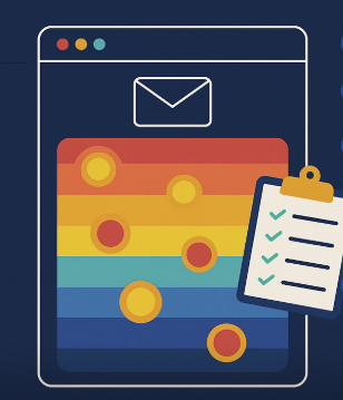
An email heatmap is a visual overlay of your email that shows where users clicked, using color gradients to represent engagement intensity:
🔴 Red = hot (high clicks)
🟡 Yellow = warm (moderate clicks)
🔵 Blue = cold (few or no clicks)
It provides immediate visual insight into how your email was consumed.
📊 What Heatmaps Reveal That Click Reports Don’t
✅ 1. User Attention Patterns
Click reports tell you that a link got 80 clicks. But was it:
The first link users saw?
A button surrounded by white space?
One of many links fighting for attention?
Heatmaps show you the visual context, helping you understand what users saw, scanned, skipped, or engaged with.
✅ 2. Cold Zones and Ignored Content
Click reports don’t show you what users ignored. Heatmaps do.
They highlight cold zones — content blocks, banners, or CTAs that users never engaged with. This helps you:
Trim unnecessary content
Reorder sections for better flow
Spot where readers lose interest
🚫 Knowing what doesn’t work is as important as knowing what does.
✅ 3. Click Misfires and Confusing Design
Have you ever had users click on an image that wasn’t linked?
Click reports don’t show these intentional misclicks, but heatmaps do. You can spot:
High engagement on unlinked elements
Decorative graphics mistaken for buttons
Layouts that mislead user attention
🛠 Fixing these improves UX and conversion rates instantly.
✅ 4. CTA Performance by Position, Not Just Volume
Click reports show how many people clicked a CTA. Heatmaps show:
Where the CTA was
Whether people saw it or missed it
Whether surrounding elements pulled attention away
📍 Use this insight to test and refine CTA positioning for higher conversions.
✅ 5. Mobile vs. Desktop Behavior Differences
Click reports rarely break down where on the screen people clicked by device.
Heatmaps give you device-specific click behavior, so you can see:
If mobile users tap images instead of buttons
If desktop users engage with headers or nav bars
If layout breaks on smaller screens
📱 This helps you optimize for mobile — where most email opens happen today.
🛠 Get These Insights Instantly with CRMx
CRMx is a heatmap and click intelligence platform built specifically for Salesforce Marketing Cloud. It turns click data into actionable visuals so you can:
🔥 See what your click reports can’t
📊 Visualize every email send with heatmaps
🧪 Compare A/B test versions side by side
💡 Optimize design, CTA, layout, and content — with confidence
CRMx helps you go from “what happened” to “why it happened” — and what to do next.
💡 Final Thought
Click reports give you numbers. Heatmaps give you understanding.
They help you:
Pinpoint friction points
Discover hidden engagement patterns
Build emails that your audience actually responds to
Don’t just track performance — see it. Learn from it. Improve it.
📈 With CRMx, turn every click into a visual insight.


