In a world of overflowing inboxes and short attention spans, grabbing — and keeping — your audience’s attention is more challenging than ever. Traditional email metrics like open rates and click-through rates (CTR) give you numbers, but they don’t always give you insight.
That’s where email heatmaps come in.
These powerful visual tools show you exactly how your subscribers interact with your emails — from the hottest (most clicked) areas to the cold zones that get ignored. In this blog, we’ll explore how email heatmaps can dramatically improve your click-through rates, engagement, and ultimately your campaign performance.
🔍 What Is an Email Heatmap?
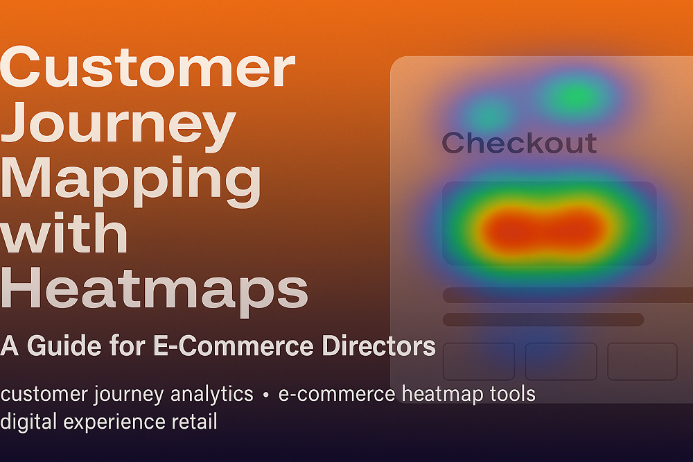
An email heatmap is a visual overlay on your email content that highlights where users clicked the most. Typically color-coded (red = high engagement, blue = low), it turns a list of click data into an intuitive map of user interaction.
Heatmaps work by tracking clicks on:
Buttons
Images
Navigation links
Text CTAs (Calls-to-Action)
📈 1. Identify High-Performing Content Instantly
With an email heatmap, you can visually spot what’s working in your campaigns:
Which CTAs are getting the most attention?
Are people clicking images instead of buttons?
Are top or bottom sections getting more engagement?
By identifying hotspots, you can replicate winning formats and content styles in future campaigns.
🎯 2. Optimize CTA Placement for Maximum Clicks
Your CTA button might be amazing — but if it’s buried too low or surrounded by distractions, people won’t click it.
Email heatmaps show you exactly where readers drop off or lose interest. Based on this, you can:
Move CTAs higher in the email
Make buttons more prominent
Reduce visual clutter around key actions
Better placement = higher click-through rates.
💡 3. Discover Unintended Click Patterns
Sometimes subscribers click on things you didn’t expect — a product image, a heading, or even your logo.
These unintentional hotspots can either be opportunities or problems:
🟢 Turn image clicks into actual links if users expect them to be clickable
🔴 Remove or replace distracting elements that steal attention from your main CTA
🚀 4. A/B Test and Validate with Visual Proof
A/B testing is a best practice — but without context, metrics like “version A had a 5% higher CTR” don’t tell the full story.
With heatmaps, you can visually compare performance between email variations:
Which version had more focus on the product section?
Did a new CTA button design drive better clicks?
Were fewer users distracted by unrelated content?
This leads to smarter design decisions backed by real engagement data.
🧠 5. Learn User Behavior and Preferences
Email heatmaps uncover behavioral trends like:
Mobile vs. desktop click behavior
Interest in new arrivals vs. clearance products
Patterns based on audience segment (e.g., UK vs. US)
By analyzing these insights, marketers can personalize campaigns, adjust layouts, and create user-first experiences that drive better results.
✅ 6. Prove Campaign ROI with Visual Reporting
Stakeholders don’t always understand complex analytics reports. Heatmaps provide a clear and shareable visual story:
“Here’s where people clicked.”
“This new CTA drove 3x more interaction.”
“This layout caused 40% of users to miss the offer.”
This makes it easier to get buy-in for design changes, budget for tools, or pitch new strategies.
🛠️ Pro Tip: Use a Tool Like CRMx or EmailHeatmaps
Platforms like CRMx offer integrated email heatmap tracking for Salesforce Marketing Cloud users, giving you advanced insights into email engagement, click intensity, and A/B testing visuals — all in one dashboard.
📊 Final Thoughts: Small Changes, Big Results
Your audience is already telling you what works — email heatmaps help you listen better.
By understanding click behavior, optimizing layout and CTA strategy, and eliminating friction points, you can turn passive readers into active clickers — and boost your email engagement and conversions.
Don’t just measure clicks. Map them.


