When it comes to email marketing, metrics like open rate, click-through rate, and conversion rate only tell part of the story. They show you what happened, but not why it happened.
That’s where email heatmaps step in — providing marketers with a visual understanding of subscriber behavior that helps refine and optimize every aspect of an email campaign.
In this post, we’ll break down exactly what email heatmaps are, how they work, and why they’re one of the smartest tools for improving your email marketing performance.
🧠 What Is an Email Heatmap?
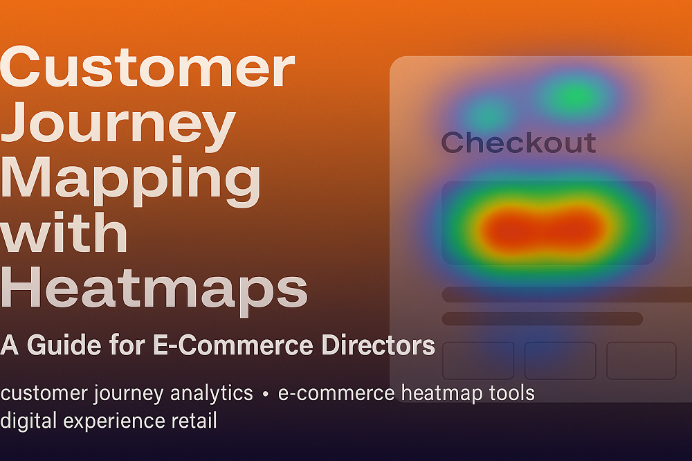
An email heatmap is a graphical representation of where subscribers click within an email. Using color-coded overlays (e.g., red for high activity, yellow for moderate, blue for low), heatmaps visually show the click intensity of various elements like:
Buttons
Text links
Images
Menus
Icons
Instead of scanning click data in a spreadsheet, you see exactly where engagement is happening—and where it’s not.
🔍 How Email Heatmaps Work
Heatmaps are powered by click-tracking technology. When a subscriber opens an email and interacts with it, the tool records:
The elements clicked
The number of clicks per element
The order and frequency of interaction
All of this data is then transformed into a visual overlay on your email content, allowing for intuitive analysis.
🚀 Why Use Email Heatmaps to Optimize Campaigns?
Here’s how they help marketers get smarter with their emails:
✅ 1. Refine CTA Placement
If users aren’t clicking your Call-to-Action (CTA), it might not be the wording—it might be the placement.
With heatmaps, you can identify:
Whether your CTA is visible without scrolling
If it's placed in a hot or cold zone
Whether alternative links are stealing attention
🛠 Fix: Move your CTA higher or make it more visually distinct to increase conversions.
✅ 2. Improve Email Layout & Flow
Heatmaps help you assess whether your layout is intuitive:
Are users scrolling and clicking as expected?
Are certain sections being skipped over?
Is the design helping or hurting performance?
🛠 Fix: Rearrange content blocks, reduce clutter, or change your visual hierarchy to keep users engaged.
✅ 3. Identify Unlinked Click Activity
Ever seen users clicking on an image or text that doesn’t lead anywhere?
With a heatmap, you’ll notice unintended hot spots—areas that users expect to be clickable.
🛠 Fix: Add links to those hotspots or redesign them to avoid confusion.
✅ 4. Test Smarter With Visual A/B Testing
Heatmaps add depth to your A/B testing strategy by showing how users engage with each version, not just which one wins.
🛠 Fix: Use heatmaps to compare click behavior between variations and double down on layouts that drive more interaction.
✅ 5. Enhance Mobile Responsiveness
Mobile clicks are often different from desktop. Heatmaps allow you to analyze mobile-specific engagement, ensuring your CTAs and content are tap-friendly and accessible.
🛠 Fix: Optimize spacing, font size, and button placement for small screens.
🛠 Tools That Offer Email Heatmaps
Some of the top email heatmap tools include:
CRMx – Advanced heatmap analytics for Salesforce Marketing Cloud
EmailHeatmaps.com – Dedicated heatmap tracking for email creatives
Mailchimp / ActiveCampaign / Brevo – Basic click mapping features
These tools provide real-time visual analytics to help you fine-tune your email marketing strategy.
📊 The Big Picture: Smarter Campaigns Start with Smarter Data
Using email heatmaps, you can go beyond basic analytics and:
Design campaigns based on real engagement
Personalize and test with precision
Drive more conversions from each send
In short: Email heatmaps make your marketing smarter, your emails clearer, and your results better.


