Email marketing isn’t dead — it’s evolving. With crowded inboxes, algorithm changes, and growing expectations for personalization, marketers can no longer rely on open rates and basic click data alone.
That’s where email heatmaps come in — a visual, intuitive, and action-driven tool that tells you not just what your audience clicks, but where and how they engage with your emails.
In 2025, email heatmaps are not a luxury — they’re a necessity. Here's why.
🔥 1. Visual Insight Into Email Engagement
Traditional reports offer numbers. Heatmaps offer clarity.
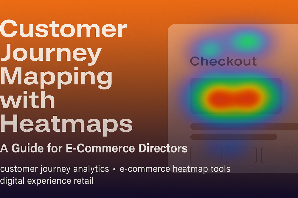
An email heatmap shows exactly where users click — highlighting high- and low-engagement areas using color gradients. Red means hot (frequent clicks), blue means cold (ignored areas).
This lets you:
Spot underperforming CTAs
See what draws the most attention
Understand layout and content performance at a glance
📈 2. Boost Click-Through Rates with Strategic CTA Placement
If your CTA is sitting in a cold zone, your conversions suffer — no matter how well-written it is.
With email heatmaps, marketers can:
Identify optimal CTA placement
Reduce distractions around critical actions
Understand if subscribers are scrolling and engaging with lower sections
This leads to smarter design decisions and better CTR results.
🧪 3. Validate A/B Testing Visually
A/B testing is powerful — but raw data doesn't always tell the full story.
Email heatmaps enhance testing by showing:
Where users are engaging more (Version A vs. B)
What elements drive better interaction
Why one layout outperforms another
Instead of guessing, you see what works — literally.
🎯 4. Improve Personalization and Segment Strategy
By analyzing heatmap patterns across different segments, you can tailor your approach:
Younger audiences clicking visuals more than buttons? Emphasize image CTAs.
Desktop users engaging more with navigation links? Optimize header menus.
International audiences skipping sections? Localize content for relevance.
Heatmaps help refine segment-level strategies, boosting engagement with every group.
📊 5. Enhance Reporting for Stakeholders
Numbers don’t always convince — visuals do.
With heatmaps, you can visually demonstrate:
Performance of layout changes
Impact of new CTA strategies
Areas that need improvement
They’re easy to understand, even for non-technical stakeholders. Great for pitching new ideas, proving ROI, and aligning cross-functional teams.
⚙️ 6. Heatmaps in a Post-Open Rate Era
Thanks to Apple’s Mail Privacy Protection and similar changes, open rates are no longer reliable as a success metric.
Click data has become the new king — and heatmaps are the crown jewel. They focus entirely on engagement and interactivity, which are what truly drive conversions.
🚀 7. Future-Proofing Your Email Strategy
2025 isn’t about sending more emails — it’s about sending smarter emails.
Marketers who rely only on open rates or basic click reports are flying blind. Heatmaps help you:
Build data-driven layouts
Focus on content that works
Continuously optimize with visual feedback
In an AI-driven, personalization-focused world, heatmaps are your roadmap.
🛠️ Recommended Tools
Some of the top platforms offering email heatmaps include:
CRMx – Heatmaps + A/B test overlays for Salesforce Marketing Cloud
EmailHeatmaps.com – Dedicated click tracking for email campaigns
Mailchimp, Brevo (Sendinblue), ActiveCampaign – Basic click mapping support
If you're on Salesforce, CRMx integrates directly and gives you actionable visual insights from your data extensions.
🧠 Final Thought
In 2025, attention is currency.
Email heatmaps show you where you’re earning it — and where you’re losing it.
For marketers aiming to stay ahead of the curve, email heatmaps are no longer optional. They’re the difference between guessing and knowing. Between sending and converting.


