Every marketer tracks clicks. But not every marketer understands them.
In the age of data-driven marketing, simply knowing your click-through rate (CTR) isn’t enough. You need to know where people are clicking, what they’re ignoring, and how their behavior impacts your results.
That’s where email heatmaps come in.
These powerful visual tools help you move from generic metrics to targeted insights — turning every email campaign into a smarter, more effective experience.
In this blog, we’ll break down 6 key benefits of email heatmaps and why they’re essential for optimizing your campaigns in 2025 and beyond.
🔥 What Is an Email Heatmap?
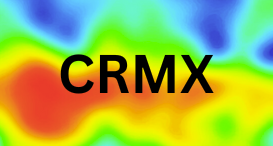
An email heatmap visually maps where subscribers click in your email. Using color gradients (hot = most clicked, cold = least clicked), it gives you a quick, intuitive look at user behavior inside your email content — no spreadsheets required.
It answers questions like:
Are my CTAs getting enough attention?
Are subscribers scrolling and engaging with lower content?
Are they clicking things that shouldn’t be clickable?
✅ 1. Reveal Exactly Where Users Engage
Traditional reports tell you that 500 users clicked.
Heatmaps tell you what they clicked.
This lets you instantly see:
Which buttons or links drive engagement
Whether people interact with images or text
Which parts of the email are being ignored
📈 Benefit: You gain true behavioral insight to optimize your layout and messaging.
✅ 2. Fix CTA Visibility and Placement
A poorly placed CTA can kill your conversion rate — even if your offer is great.
Email heatmaps help you:
Identify if CTAs are too low on the page
Spot areas that are stealing attention
Test ideal button placement
📍 Fix the scroll gap, place CTAs in hot zones, and boost click-throughs.
✅ 3. Spot & Eliminate Dead Zones
Most emails have “cold zones” — areas no one interacts with.
With heatmaps, you can:
Trim unnecessary content
Rearrange layout for flow
Highlight the most engaging elements
🧠 Smarter design = better performance.
✅ 4. Understand Mobile vs. Desktop Behavior
User behavior varies by device. What works on desktop might fail on mobile.
Heatmaps reveal:
Differences in click patterns
Mobile tap vs. desktop click behavior
Elements too small or misplaced for mobile users
📱 Result: Responsive designs that actually perform — not just look good.
✅ 5. Optimize A/B Tests with Visual Insights
A/B testing tells you which version won.
Heatmaps tell you why.
Use heatmaps to:
Compare click distribution across variants
Identify visual/design differences
Improve test quality and decision-making
🔁 Less guessing. More precise testing.
✅ 6. Get Clearer Reports for Stakeholders
Stakeholders don’t want data dumps — they want clarity.
Heatmaps offer a visual report that communicates:
What content worked
Where users clicked
Where engagement dropped off
📊 Use this to secure buy-in, share results with leadership, and demonstrate ROI more effectively.
🛠 Power All These Benefits with CRMx
If you use Salesforce Marketing Cloud, there’s only one purpose-built solution for deep email engagement visibility:
✅ CRMx – Click Intelligence & Heatmap Analytics
🔥 Visualize clicks across every email send
🧪 Run A/B test overlays with real engagement comparison
📊 View ranked CTA performance and click timestamps
💡 Optimize emails faster and more confidently
Turn every click into a strategic insight — only with CRMx.
💡 Final Thoughts
Click data is useful. But click intelligence is powerful.
With email heatmaps, you no longer have to guess what your audience is doing — you can see it. And when you understand how subscribers behave, you can design emails that convert faster, smarter, and more consistently.
📈 Turn clicks into insights. Turn insights into growth.