In a world where inboxes are overflowing and user attention is fleeting, getting a solid return on investment (ROI) from your email marketing campaigns can feel like a moving target.
Most marketers rely on traditional metrics like open rate and click-through rate (CTR) to gauge performance — but these numbers only scratch the surface. If you’re not using heatmap analytics, you’re likely missing out on insights that could drastically improve your email ROI.
In this blog, we’ll explore the untapped power of email heatmaps, and how they help you optimize campaigns, enhance engagement, and turn every send into a smarter investment.
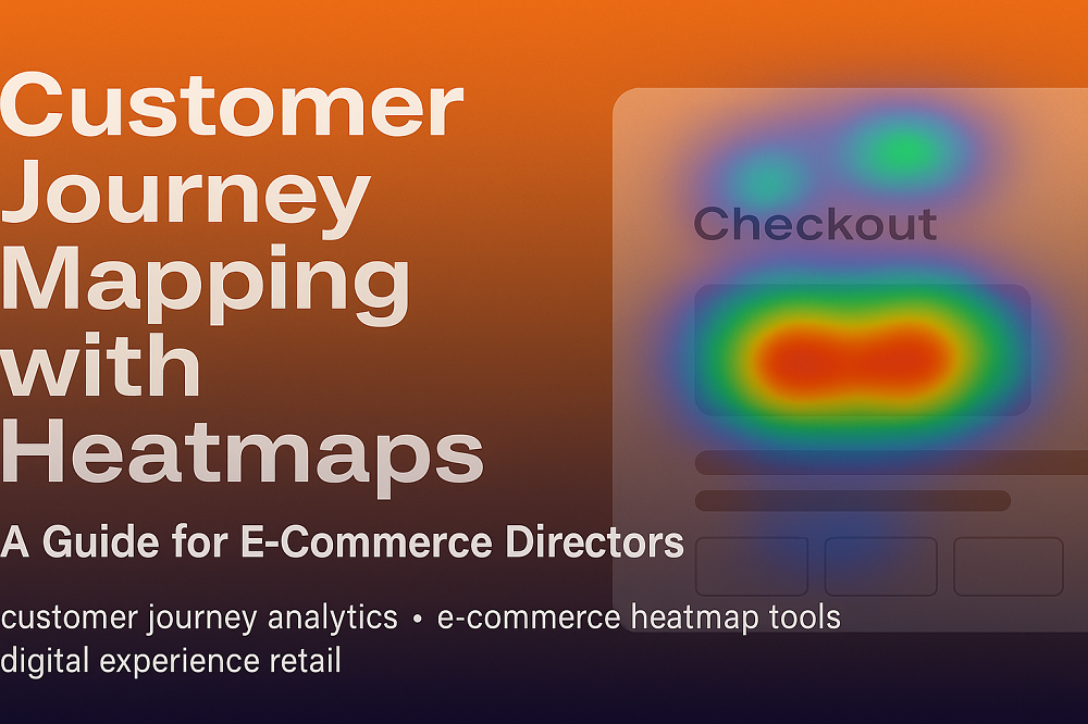
📊 What Are Heatmap Analytics for Email?
Heatmap analytics visually show where your subscribers click inside your email. Using a color-coded overlay — with hot zones (red/yellow) and cold zones (blue/grey) — heatmaps give you instant insight into:
Which CTAs perform best
What content draws the most attention
Where users are losing interest or getting distracted
It’s not just about the number of clicks. It’s about the behavior behind the clicks.
💥 Why Heatmaps Matter for Email ROI
ROI isn’t just about how many people clicked. It’s about optimizing every part of your email — content, layout, design, timing — to drive better results with fewer resources.
Here’s how heatmaps help you do exactly that:
✅ 1. Increase Click Efficiency with Better CTA Placement
Every email has a goal. If your call-to-action (CTA) isn’t being clicked, you’re losing money.
Heatmaps help you:
Identify CTAs buried too low
Spot competing links stealing attention
Move high-priority buttons into hot zones
📈 Result: Higher CTR, more conversions, better ROI per email sent.
✅ 2. Reduce Content Waste
Creating content costs time and money. But if half of it is being ignored?
Heatmap analytics show you:
Which sections are completely skipped
What images or copy aren't pulling engagement
Where to cut or reformat to boost performance
🧠 Smarter content = fewer resources wasted.
✅ 3. Diagnose and Fix Drop-Off Points
Heatmaps reveal where users disengage:
Low click activity at the bottom of the email?
Dead zones in the middle?
Engagement falling after a certain section?
🎯 Use this data to restructure layout and flow — keeping readers engaged until the end.
✅ 4. Personalize Based on Behavior
Want better segmentation? Heatmaps help you identify behavioral trends like:
Users who prefer clicking product images vs text links
Mobile users skipping top nav menus
Location-specific engagement patterns
🎁 Use these insights to personalize content, target more effectively, and reduce unsubscribes — all of which drive better ROI.
✅ 5. Support Smarter A/B Testing
A/B testing is powerful — but only when backed by visual context.
Heatmaps show why one version outperformed the other, not just which one did. You’ll know:
Which elements drew more attention
How CTA design or layout impacted clicks
Which variant created more action in fewer steps
🔄 This means fewer tests, faster optimizations, and more profitable sends.
🚀 Supercharge ROI with CRMx Heatmap Analytics
If you're ready to go beyond vanity metrics and into real engagement intelligence, it's time to explore CRMx — the only dedicated heatmap analytics platform built specifically for Salesforce Marketing Cloud.
With CRMx, you get:
🔥 Click heatmaps for every email campaign
📊 Real-time performance visualizations
🧪 A/B test overlays and comparison dashboards
💡 Behavioral insights to guide strategy
💼 ROI-driven recommendations for campaign optimization
Stop guessing. Start seeing exactly what works.
💡 Final Thought
Most marketers are leaving money on the table by ignoring how users truly engage with their emails. Heatmap analytics change that.
They help you:
Pinpoint performance leaks
Optimize layouts and messaging
Maximize conversions without sending more
📈 Smaller improvements. Bigger ROI. Smarter marketing.
It’s all possible with the untapped power of heatmap analytics from CRMx.