Salesforce Marketing Cloud (SFMC) gives campaign managers reliable email reporting—opens, clicks, CTRs, and A/B test results.
But despite all that data, one frustration keeps coming back:
“I know what happened. I don’t know why it happened.”
If you’ve ever stared at an SFMC click report and still felt unsure about your next optimisation step, you’re not alone. This article explains why Salesforce Marketing Cloud click reports fall short—and what campaign managers need instead.
What Salesforce Marketing Cloud Click Reports Do Well
Let’s be clear: SFMC click reporting is accurate and powerful.
It tells you:
How many clicks an email received
Which links were clicked
Unique vs total clicks
CTR by send or journey
A/B test winners
For tracking performance at a high level, this works well.
But optimisation doesn’t live at a high level.
The Core Problem: Click Reports Are Not Visual
SFMC click reports are presented as tables and rows.
That means campaign managers must:
Read link names
Compare click counts manually
Remember where each link appeared in the email
Guess how layout influenced behaviour
In reality, subscribers don’t experience emails as rows of data.
They experience emails visually.
And this is where traditional click reports break down.
Problem #1: Click Reports Don’t Show Where Attention Went
An SFMC report might tell you:
CTA A received 120 clicks
CTA B received 80 clicks
But it doesn’t show:
Which CTA users noticed first
Whether clicks clustered in one section
If an image pulled attention away from your main CTA
Without visual context, campaign managers are left guessing.
Problem #2: Layout Impact Is Invisible in Reports
Email layout plays a huge role in performance:
CTA placement
Content hierarchy
Image positioning
Scroll depth
SFMC reports can’t answer questions like:
Did users engage more at the top or middle?
Was the hero image distracting?
Did secondary links steal clicks?
Yet these are exactly the questions that matter when optimising emails.
Problem #3: Click Tables Slow Down Optimisation
To make sense of click data, teams often:
Export reports
Filter rows
Compare multiple sends
Create screenshots or slides for stakeholders
This slows decision-making and increases friction between:
Campaign managers
Designers
Stakeholders
Agencies
When optimisation takes too long, teams default to repeating the same templates.
Problem #4: A/B Test Results Lack Context
Salesforce Marketing Cloud A/B testing tells you which version won.
It doesn’t tell you:
Why Version B outperformed Version A
Which section drove the lift
Whether engagement shifted earlier or later in the email
As a result, teams often repeat A/B tests without truly learning from them.
Problem #5: Click Reports Don’t Expose Hidden Opportunities
Some of the biggest optimisation opportunities are subtle:
A text link outperforming a button
A secondary CTA pulling more clicks than the primary one
Important content being skipped entirely
These insights are buried in tables—and often missed.
What Campaign Managers Actually Need
Campaign managers don’t need more numbers.
They need clarity.
Specifically, they need:
Visual understanding of engagement
Clear patterns of attention
Faster post-campaign analysis
Confident optimisation decisions
This is where email heatmap intelligence comes in.
How Email Heatmaps Fill the Gap
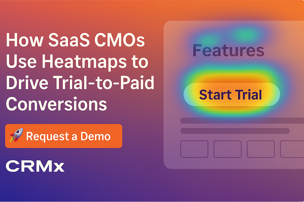
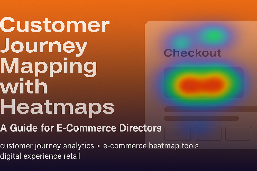
An email heatmap transforms SFMC click data into a visual overlay on the email itself.
Instead of reading reports, you can see:
Which CTAs attract the most clicks
Which sections are ignored
How engagement flows down the email
Where optimisation will have the biggest impact
Heatmaps don’t replace SFMC reports—they complete them.
Click Reports vs Email Heatmaps
Salesforce Click Reports
Email Heatmaps
Tables and rows
Visual overlays
Link-level focus
Layout-level insight
Requires interpretation
Instantly understandable
Time-consuming analysis
Faster decision-making
Shows what happened
Shows why it happened
Why This Matters for Salesforce Marketing Cloud Teams
For SFMC campaign managers, time and confidence matter.
Email heatmaps help teams:
Optimise faster
Reduce guesswork
Improve CTR without redesign
Communicate insights clearly to stakeholders
Learn more from every A/B test
When visual intelligence is added to click data, optimisation becomes proactive instead of reactive.
How CRMX Extends Salesforce Marketing Cloud Reporting
CRMX is built specifically to add email heatmap intelligence on top of Salesforce Marketing Cloud.
With CRMX, teams can:
Load emails by name, Job ID, or journey
Visualise click engagement directly on email layouts
Rank CTAs and content blocks by engagement strength
Compare email versions visually
Export insights for reporting and optimisation discussions
CRMX doesn’t change your SFMC setup—it enhances how you understand performance.
Final Thoughts
Salesforce Marketing Cloud click reports tell you what happened.
But they don’t tell you why subscribers behaved the way they did.
If your team is spending hours analysing reports and still guessing what to optimise, the problem isn’t your strategy—it’s your visibility.
Email heatmap intelligence bridges that gap.
Want to See the Difference?
See how Salesforce Marketing Cloud click data turns into visual email intelligence.
Request a demo and experience email heatmaps built specifically for SFMC teams.


