In the fast-paced world of email marketing, data is everything. But not all data tells the full story. While traditional reports give you the numbers—like open rates, click-through rates (CTR), and bounce rates—they often fall short when it comes to understanding user behavior.
That’s where email heatmaps come in.
In this blog, we’ll break down the key differences between email heatmaps and traditional reports, and show you exactly what you’re missing if you’re relying on numbers alone.
📊 What Are Traditional Email Reports?
Traditional email reports typically include:
Open Rate
Click-Through Rate (CTR)
Bounce Rate
Unsubscribes
Device breakdowns
These reports are essential—they give you performance metrics at a high level. But here’s the problem:
They tell you what happened. Not why it happened.
If your CTR is low, you know something isn’t working—but you don’t know which element failed. Was it the CTA? The layout? The placement?
🔥 What Is an Email Heatmap?
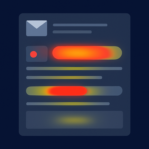
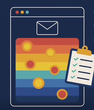
An email heatmap is a visual representation of user engagement inside an email. It shows where subscribers clicked using a color-coded overlay:
Red = Most clicked
Yellow = Moderately clicked
Blue = Least clicked or ignored
Instead of analyzing rows of click data, heatmaps give you instant insight into user behavior and attention.
⚔️ Email Heatmaps vs Traditional Reports: Key Differences
| Feature | Traditional Reports | Email Heatmaps |
|---|---|---|
| Shows clicks? | ✅ Yes | ✅ Yes |
| Shows where clicks happened? | ❌ No | ✅ Yes |
| Visual layout analysis | ❌ No | ✅ Yes |
| Understands user behavior | ⚠️ Limited | ✅ Strong |
| Detects layout/design issues | ❌ No | ✅ Yes |
| CTA performance comparison | Basic | Visual & contextual |
| Identifies distraction points | ❌ No | ✅ Yes |
🔍 What You’re Missing Without Heatmaps
1. 🎯 CTA Click Context
Traditional CTR tells you how many people clicked.
Heatmaps tell you where they clicked and what they might have skipped.
2. 🧭 Layout Performance
Traditional reports don’t reveal if users stopped scrolling halfway through your email.
Heatmaps do.
3. 🚫 Distraction Detection
If users click on decorative images instead of CTAs, traditional reports won’t catch that.
Heatmaps reveal these “misclicks” so you can fix them.
4. 🧪 Smarter A/B Testing
You may know that version A got more clicks—but why?
With heatmaps, you can visually compare how each version performs across every section.
5. 📱 Mobile-Specific Behavior
Heatmaps help you optimize design for mobile taps, not just desktop clicks—vital when most users are opening emails on phones.
🚀 Ready to Go Beyond Numbers?
If you’re relying solely on traditional reports, you’re only seeing the tip of the iceberg. With email heatmaps, you gain full visibility into:
Real user behavior
Click distribution across your content
Which elements drive engagement—or cause confusion
🛠 The Smarter Tool: CRMx
CRMx is built to help you go deeper than open rates. As a dedicated email heatmap and analytics platform for Salesforce Marketing Cloud, CRMx gives you:
Visual click heatmaps for every email send
Click-through breakdown by content zone
A/B test comparisons in one view
Easy-to-read dashboards for stakeholders
Enhanced email design optimization workflows
With CRMx, you get the full picture—not just the numbers.
✅ Final Thought
Traditional reports are essential—but incomplete.
To truly optimize your email marketing, you need to understand how subscribers engage, where they click, and what they ignore.
Email heatmaps bridge that gap—turning data into decisions.
So if you’re still relying only on numbers, it’s time to step into the future of email analytics with CRMx.


