Email marketing isn’t just about writing great copy or designing eye-catching templates — it’s about understanding how subscribers engage with your content and using that insight to optimize performance.
Yet most marketers rely on standard metrics like opens and clicks to guide their decisions. The problem? These metrics only tell part of the story.
To truly unlock your campaign’s potential, you need visual context — and that’s exactly what email heatmaps deliver.
In this blog, we’ll explain why email heatmaps are the ultimate tool for visualizing performance, uncovering hidden patterns, and making smarter, faster decisions.
👀 What Are Email Heatmaps?
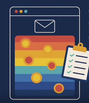
An email heatmap is a visual overlay on your email that shows where subscribers click, using color gradients to indicate engagement intensity:
🔴 Red = high activity (hotspots)
🟡 Yellow = moderate activity
🔵 Blue or grey = low or no activity
It gives you immediate visual insight into which parts of your email attract attention — and which parts get ignored.
💥 Why Heatmaps Outperform Traditional Reports
Traditional email analytics give you numbers.
Heatmaps show you behavior.
| Feature | Traditional Reports | Heatmaps |
|---|---|---|
| Click totals | ✅ Yes | ✅ Yes |
| Click locations | ❌ No | ✅ Yes |
| Visual layout analysis | ❌ No | ✅ Yes |
| Identify distraction zones | ❌ No | ✅ Yes |
| Understand CTA engagement | Partial | ✅ Fully |
| Optimize based on visuals | ❌ No | ✅ Yes |
🎯 Key Benefits of Visual Email Performance with Heatmaps
1. Instantly Spot What’s Working
See what content, images, and buttons draw the most clicks.
🔎 No need to dig through reports — one glance tells the story.
2. Fix Underperforming Areas
Discover cold zones and confusing layouts.
🛠 Shift content, redesign sections, or move CTAs to increase engagement.
3. Test Layouts Visually
A/B testing is better with heatmaps.
Compare click patterns side by side and learn why one version outperformed the other.
4. Optimize for Mobile vs Desktop
Heatmaps show differences in engagement across devices.
📱 Tap zones vs. 🖱️ click zones — design better experiences for both.
5. Deliver Better Reports
Stakeholders love visuals.
Heatmaps provide a simple, shareable way to demonstrate what’s working and what needs to change.
🛠 Unlock Visual Insights with CRMx
If you use Salesforce Marketing Cloud, there’s one platform that turns email performance into a powerful visual story:
✅ CRMx — Your Go-To Heatmap & Click Intelligence Tool
🔥 Visual click tracking for every email send
🧪 A/B test overlays to compare engagement
📊 CTA ranking and timestamp-based analysis
💼 Easy-to-read dashboards for teams and leadership
⚙️ Seamless integration with Salesforce Marketing Cloud
CRMx helps you stop guessing and start designing emails that actually perform.
✅ Final Thoughts
When it comes to email marketing, data is good — but visual data is better.
Email heatmaps bridge the gap between what users do and what your reports say. They give you the clarity, context, and confidence to make fast, impactful changes to your campaigns.
So if you want smarter insights, better designs, and higher conversions, it’s time to make heatmaps your go-to tool — starting with CRMx.


