
Salesforce Marketing Cloud (SFMC) offers powerful data on opens, clicks, and conversions — but these traditional metrics can only take you so far. If you want to truly understand how subscribers interact with your emails and optimize them for better performance, you need more than numbers.
You need visual intelligence — and that’s exactly what a click heatmap tool delivers.
In this guide, we’ll walk you through how to use a click heatmap tool inside SFMC to pinpoint engagement hotspots, fix underperforming content, and ultimately boost your email conversions — using CRMx, the leading heatmap analytics tool for SFMC.
🔍 What Is a Click Heatmap Tool?
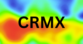
A click heatmap tool visualizes where users click within your email. It uses a color-coded overlay:
🔴 Red: most clicked areas
🟡 Yellow: moderately clicked
🔵 Blue/grey: least clicked or ignored
Unlike click reports, which show you how many people clicked a link, heatmaps reveal how subscribers interact with your email layout — visually.
🚀 Why Click Heatmaps Matter for Conversion Optimization
Conversions come from engagement. And engagement depends on:
Where your CTAs are placed
What content users interact with
What gets skipped, ignored, or misunderstood
Click heatmaps answer all of this — and help you take action based on real user behavior.
🛠 Step-by-Step: Using CRMx Heatmaps in Salesforce Marketing Cloud
Here’s how to boost conversions using CRMx — the click heatmap tool purpose-built for SFMC:
✅ Step 1: Connect CRMx to Your SFMC Instance
CRMx uses email job IDs to map your campaigns automatically. Once connected, it tracks and stores click data from each email send — no manual coding or tagging required.
✅ Step 2: Launch Your Email Campaign as Usual
Send your email campaign through SFMC as you normally would. CRMx will automatically detect:
Click behavior per subscriber
Device used (mobile vs. desktop)
Engagement timestamps
✅ Step 3: View Heatmaps in the CRMx Dashboard
After sending, log in to your CRMx dashboard to view:
A full heatmap of your email
Click intensity zones
Ranked CTA performance
A/B test overlays (if applicable)
The interface is visual, intuitive, and ideal for quick insights — even for non-technical users.
✅ Step 4: Identify Engagement Patterns and Cold Zones
Ask yourself:
Are subscribers clicking your main CTA or something else?
Are important sections being ignored?
Are images getting more clicks than buttons?
Is your content scroll-heavy or well-structured?
CRMx heatmaps give you the answers.
✅ Step 5: Make Data-Driven Design and Content Changes
Now that you know how users are behaving:
Move CTAs to high-engagement zones
Cut underperforming sections
Link “hot” image zones that weren’t previously clickable
Optimize layouts for mobile behavior if needed
💡 Tip: Run an A/B test next using CRMx’s visual comparison feature to validate your improvements.
💼 Who Should Use CRMx in SFMC?
CRM teams running lifecycle journeys
Campaign managers monitoring email performance
Designers improving email UX
Marketers optimizing for conversions
Analysts needing visual data for stakeholder reporting
✅ Final Thoughts
If your SFMC campaigns aren’t converting the way you hoped, it’s time to stop guessing and start visualizing.
With CRMx, you get a complete engagement map of your email — helping you fix weak spots, highlight what’s working, and ultimately drive more conversions from every send.
📬 See what your subscribers are doing. Act on it. Win more.