Introduction
Open rates and click-through rates (CTR) have long been the go-to metrics for email marketers. They tell you if your subject line worked or if someone clicked a link — and that’s useful.
But if that’s all you’re tracking, you’re only seeing a tiny fraction of your audience’s behavior.
To truly understand how people interact with your emails — what grabs their attention, what they skip, and where they get stuck — you need email heatmaps.
In this blog, we’ll explore how email heatmaps go beyond basic metrics to reveal deep insights about your audience — insights that help you design smarter campaigns and drive real results.
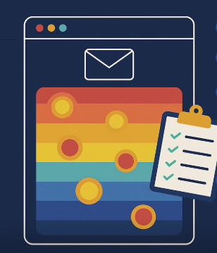
🔥 What Are Email Heatmaps?
An email heatmap is a visual report that shows exactly where users click within your email. Using a color-coded overlay (red = high engagement, blue = low), heatmaps make it easy to:
- See where attention is focused
- Identify dead zones with no interaction
- Spot unexpected behavior (like clicking unlinked images)
Unlike raw data, heatmaps show you how your audience behaves, not just whether they clicked.
🧠 What Heatmaps Reveal That Opens and Clicks Don’t
1. Content Relevance by Section
An email may have a 15% CTR — but which section drove it?
Heatmaps show if users clicked:
- The hero banner
- A mid-email promo
- The CTA at the bottom
- Or even something unlinked
📍Why it matters: You can remove what’s not working and double down on what is.
2. Audience Attention Span and Scroll Behavior
Are users scrolling through your entire email or dropping off halfway?
Heatmaps reveal whether your audience:
- Engages with bottom content
- Misses secondary CTAs
- Only clicks content above the fold
📉 Result: You adjust email length and layout based on real audience behavior.
3. Unintended Click Behavior
Sometimes users click on:
- Product images that aren’t linked
- Decorative icons
- Your logo expecting to go to the homepage
👀 Insight: Your audience is telling you where they expect functionality — even if you didn’t build it in.
4. Preferred Interaction Styles
Heatmaps show trends like:
- Do users prefer text links or buttons?
- Are they clicking image carousels or ignoring them?
- Are mobile users tapping different zones than desktop users?
📲 This helps you tailor content for different audience preferences and platforms.
5. Micro-Segmentation Opportunities
By comparing heatmaps across segments (e.g., country, age, purchase history), you can uncover:
- Content preferences by region
- CTA behavior by device type
- Interest in categories (e.g., sale vs. new arrivals)
🎯 Use these insights to personalize content and drive better results per segment.
📈 From Insights to Action: Smarter Email Strategy
Understanding your audience through heatmaps helps you:
- Refine your visual hierarchy
- Place CTAs in engagement zones
- Eliminate blind spots in your layout
- Test with purpose (not just hope)
You’re no longer guessing what works. You’re seeing it.
🛠 Reveal Audience Behavior with CRMx
To get the full value of heatmaps, you need a platform that turns email data into visual intelligence — and that’s exactly what CRMx does.
CRMx is the heatmap solution built for Salesforce Marketing Cloud, giving you:
- 🔥 Real-time click tracking and heatmaps
- 🧪 A/B test engagement overlays
- 📊 Click timestamps and CTA performance rankings
- 💼 Easy insights for marketers, designers, and stakeholders
Go beyond opens and clicks — and understand what your audience really wants.
💡 Final Thought
Email heatmaps are more than a reporting tool — they’re a behavioral lens into your audience. They tell you:
- What captures attention
- What drives action
- What’s being ignored
With that insight, you can build smarter, sharper, and more successful email campaigns — every time.
📬 Let CRMx show you what your audience is trying to tell you.
🚀 Request a CRMx Demo